

Color Trend Forecast Spring & Summer 2027
- Britta Cabanos
- May 5
- 8 min read

Color is where every collection begins. Before the silhouette, before the fabric, before the print — there is the palette. And for Spring/Summer 2027, the color story is one of the most balanced and commercially versatile we've seen in several seasons.
This isn't a season that demands you choose a side. The S/S 2027 palette holds two distinct energies in tension — warm, earthy depth on one side and cool, digitally-influenced brightness on the other — and gives designers room to build collections with genuine range. Whether your aesthetic leans toward handcrafted naturalism or clean synthetic precision, there is a color story here that works for you.
Below is a complete breakdown of the season's key color directions, drawn from raw material trade shows and early runway releases. We've included hex codes, Pantone references where available, and specific notes for independent designers and small brands throughout.

A note on how we use trends
Color trends get a bad reputation — and honestly, some of it is earned. When "trend" becomes shorthand for "produce more, move faster, chase every micro-season," it works against everything independent designers and conscious brands are trying to build. But color intelligence, when used well, is different. It's an early signal: awareness of where cultural mood, material innovation, and consumer appetite converge. For small brands and independent designers, knowing this before you commit to production is one of the most practical tools you have — it means sourcing more intentionally, building palettes with longevity in mind, and designing pieces that feel considered rather than reactive. What you'll find below isn't a checklist to follow. It's a foundation to think from.

🌿 Coloro Color of the Year 2027: Luminous Blue
Every year, color authority Coloro names a Color of the Year — a shade that captures the cultural and aesthetic mood of the moment and offers a commercially reliable anchor for brands and designers building palettes. For 2027, that shade is Luminous Blue.
Luminous Blue is a deep, cobalt-inspired blue — magnetic, vibrant, and unusually versatile. It sits at the intersection of past and future: it carries the timeless authority of a classic navy but with a luminous, almost electric quality that feels entirely contemporary. It's a shade that works equally well as a hero tone across an entire garment, a contrast accent in footwear and accessories, or a rich backdrop for prints and embroidery.
What makes Luminous Blue particularly valuable for independent designers and small brands is its trans-seasonal and gender-inclusive appeal. It doesn't belong exclusively to women's or men's wear; it doesn't read as summery or wintry — it simply reads as confident and considered. A brand that builds around it now, before it reaches peak saturation, has a genuine first-mover advantage.
Key Shades:


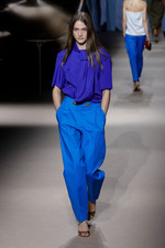


Designer note: Luminous Blue appears across categories this season — in apparel as both a hero tone and a contrast accent, in footwear with a high-shine finish, and in accessories as a monochromatic statement. If you're building a capsule or a core palette for S/S 2027, this is the shade worth committing to early.

The season's five color groups
Beyond Luminous Blue, S/S 2027 organizes itself into five distinct palette groups — each with its own commercial logic and design application. Understanding how they relate to each other is as useful as knowing the individual shades.
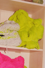
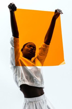
1. Vibrant — energy and expression
Key Shades:

Sunny yellow and citrus orange connect to the season's warm, earth-rooted Latin-influenced direction. Hot pink and lime green carry the cool, synthetic energy of the digital aesthetic. Transformative teal — highlighted specifically by Coloro as a key directional shade — bridges both worlds, sitting equally comfortably in a nature-inspired palette and a tech-forward one.


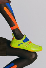

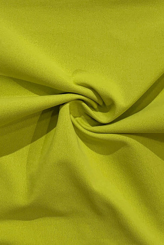

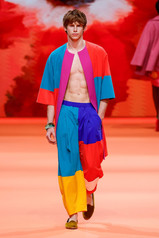


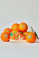


Designer note: The vibrant palette is strongest in small, intentional doses. One vibrant piece in an otherwise neutral collection creates a focal point. An entire collection in these shades risks looking costume-like rather than considered. Think about where your customer's eye should land — and put the vibrant shade there.
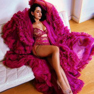
2. Dark — depth and timelessness
Key Shades:

The dark palette is where the season's longevity lives. These are not trend shades — they are investment shades, the kind that a customer reaches for repeatedly across a wardrobe and that retain their relevance long after the season has moved on.
Burnt yellow deserves particular attention. It has had strong staying power since Winter 2026/27 and shows no sign of fading — making it one of the safest palette investments for any brand-building stock across multiple seasons. Swamp green and navy blue offer a quieter, more timeless counterpoint to the season's brighter energy, anchoring collections that might otherwise feel too trend-driven.
Deep saffron connects the dark and vibrant groups — warmer and more saturated than a traditional dark shade, but grounded enough to anchor rather than excite.


Designer note: For small brands building a considered collection, one well-chosen dark anchor shade is more valuable than several vibrant ones. It's the shade your customer pairs everything with — the one that makes the rest of the collection work together. Burnt yellow is the strongest commercial choice from this group for S/S 2027.
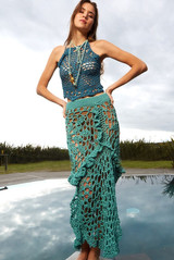
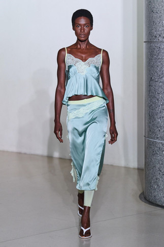
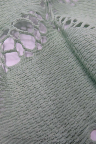
3. Light — washed and airy
Key Shades:

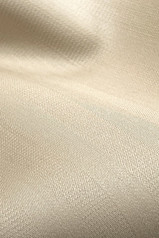
The light palette reflects the season's quieter, more introspective current — a desire for calm and ease that runs alongside the more expressive, vibrant direction. These shades suit natural fabrics beautifully: the slight irregularity of linen, the soft drape of cotton voile, the gentle sheen of a silk-blend satin all carry light shades in a way that synthetic fabrics simply don't.
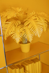
Faded blue is the standout shade in this group — it pairs especially well with the season's light denim and linen directions and has strong crossover appeal across genders and categories. Buttery yellow bridges the light and vibrant groups, soft enough to feel restful but warm enough to feel alive.
Blush and powder lilac extend the season's gentle, romantic sensibility — both connect to the handcraft-forward themes running through womenswear and the broderie anglaise and lace directions in materials.


Designer note: Light shades are where fabric quality becomes most visible — an imprecise or cheap fabric in a light shade reads immediately as low quality. If you're working in this palette group, invest in the fabric first. The shade will do the rest.
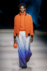
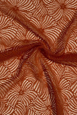
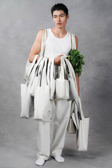
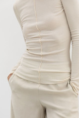
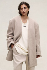
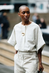
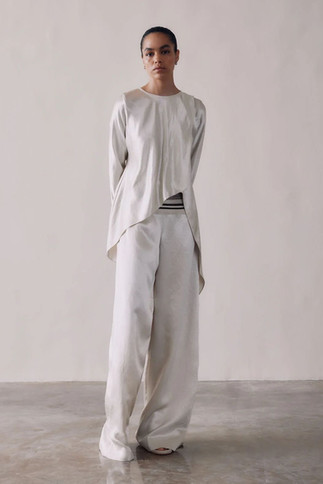
4. Neutrals — warm and grounded
Key Shades:

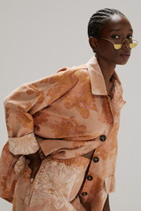
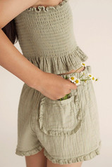
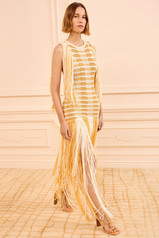
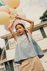
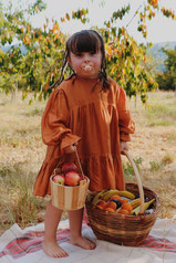
The neutral palette for S/S 2027 runs warmer than previous seasons. Pure white and black remain — they are never not relevant — but the most interesting neutrals this season are the warm, earthy ones: terracotta, sand beige, and coffee brown, all of which connect directly to the season's handcraft-influenced, earth-rooted design themes.
These are not background colors. In S/S 2027 the warm neutrals carry their own weight as primary palette choices — particularly terracotta, which has built consistent commercial momentum over the past two seasons and shows no sign of peaking. Sand beige is the season's most versatile neutral, sitting comfortably alongside both the vibrant and light palette groups and working across every category from tailoring to beachwear.
Mid gray deserves a mention as the season's cool neutral anchor — connecting to the Digital Minimalism theme and offering a sophisticated, urban counterpoint to the warmer earth tones.


Designer note: A warm neutral palette is the most commercially reliable foundation for a small brand. Customers who might hesitate with a vibrant or trend-forward shade will reach for a well-executed terracotta or sand beige. Build your core in neutrals, use your vibrant and dark shades for the pieces that create desire.
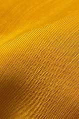
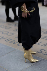
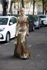
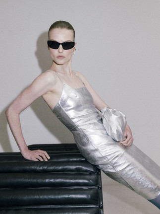
5. Metallics — finish and texture


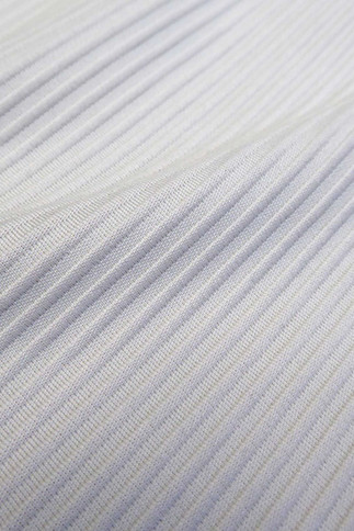
Silver and gold arrive this season not as flat colors but as finishes — expressed through fabric construction rather than pigment. Lurex threads woven into knits, metallic wire incorporated into beachwear fabrics, satin sheens on lightweight wovens, and laminated finishes on leather and synthetic surfaces. The effect is sophisticated rather than flashy: a considered shimmer rather than an all-over statement.
Gold is predominant, especially in low-contrast designs — highlighting knits in warm, earthy shades where the metallic thread catches the light without overwhelming the base color. Silver appears more in the season's cooler, more architectural direction, connecting to the Digital Minimalism aesthetic.
(Silver and gold — expressed through fabric finish rather than flat color. See Pantone Metallics range for physical reference)
Key shades:
· Silver: #C8C0A8
· Gold: #D4A840


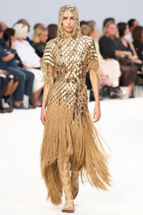


Designer note: Metallics are among the most effective ways for small brands to add perceived value to a simple silhouette. A ribbed knit in a warm neutral with gold Lurex thread reads as significantly more premium than the same knit in a flat color, with minimal additional cost or production complexity.
How to build a palette for S/S 2027
With this many directions available, the most useful question isn't "which colors are trending?" but "which colors make sense for my brand, my customer, and my production capacity?"
Here is a simple framework for building a considered S/S 2027 palette as an independent designer or small brand:

1. Start with one anchor shade. Choose one color that will appear across multiple pieces and connect the collection — Luminous Blue, a warm neutral like sand beige or terracotta, or a dark anchor like burnt yellow. This is the shade your customer remembers.
2. Add one light and one dark. A light shade (faded blue, buttery yellow, soft sage) and a dark shade (navy, swamp green, deep saffron) give your collection range without requiring many individual colors.
3. Choose one vibrant accent. One shade from the vibrant palette — used in one or two key pieces — creates the moment of desire in a collection. It's the piece that photographs well, gets shared, and drives interest in the quieter pieces around it.
4. Use metallics through fabric, not paint. If you want to incorporate gold or silver, do it through fabric finish rather than color — a Lurex yarn, a satin weave, a metallic laminate. It reads as more considered and is easier to work with across a collection.
5. Test your palette against your fabrics before committing. The way a shade reads changes completely depending on the fabric it's on — a terracotta in linen and a terracotta in polyester satin are very different things. Source your fabric samples before finalizing your color choices.
Want the full S/S 2027 breakdown?
This post covers the color story in full — but color is just one part of the S/S 2027 picture. The complete trend report, available free to Inside Fashion Design members, also includes:
17 material directions across womenswear, menswear, and beachwear with sustainable sourcing notes on each
16 print and pattern families, with context on commercial application
6 styling themes across womenswear and menswear, each with specific guidance for independent designers and small brands
An interactive format with jump-to navigation, expandable sections, and polls to see what's resonating across the community
Membership is free, and the full report awaits you on the other side.
Free membership. No credit card required. Already a member? Log in here.
Found this useful? Share it with a designer friend — or save it to Pinterest for reference as you build your S/S 2027 palette.
Want to use AI to research and create trend forecasts like this — in a fraction of the time? The Future-Proof Your Fashion Brand Bootcamp teaches you exactly how to do this, while also covering AR, VR, investor pitching, and brand visual creation.
→ Learn more and enroll here
What colors are you using for Sp/Su 2026? How are you incorporating Eco- friendly practices? We would love to hear! Share in the comments.
Thanks for reading today! We appreciate you!
Color directions sourced from START by WGSN Spring/Summer 2027 reports. Pantone and Coloro codes referenced from the original trade show analysis. Hex codes are approximate digital translations for reference purposes. All rights to original research belong to WGSN.