
Design How To: Fabric Lab Dips and Strike Offs: Everything You Need to Know
- Britta Cabanos

- Jan 29, 2024
- 5 min read
Updated: Jan 30, 2024

In the fashion industry, lab dips are small samples of fabric that are dyed to match a specific color. They are usually created by a textile supplier or manufacturer and sent to the designer for approval before the final fabric is produced. Read on for Fabric Lab Dips and Strike offs explained.
Lab Dips Explained:
A lab dip can be used to confirm the color accuracy of a fabric before it is produced in bulk. It can also help the designer visualize how the color will appear in the final product and make any necessary adjustments.
Creating a lab dip involves following a specific recipe for dyeing the fabric, including the dye concentration, temperature, and time of the dyeing process. The lab dip is then sent to the designer or manufacturer for approval. This may take a few iterations, then once the color is approved, the final fabric is produced using the same recipe as the lab dip.

Lab dips are an important part of the production process for fashion designers and textile manufacturers, as they ensure that the final product meets the desired color specifications.

I love this article from Kristen Anderson, further explaining Color Standards, Lab Dips, and Why You Need Both!

Here is even more in-depth article filled with great information: Lab Dips in the Garment Manufacturing Industry: A Comprehensive Guide
by Naim Islam for TimeofTextiles.com
When working in fashion design & development, chances are you will encounter the lab dip approval process. Here is your guide to Mastering Fabric Lab Dip Approval; A Comprehensive Guide for Fashion Designers:
As a fashion designer, one of the crucial stages in the production process is approving fabric lab dips. These lab dips serve as prototypes for the fabric that will be used in your designs, and ensuring their accuracy is paramount to maintaining the integrity of your vision. Here's a comprehensive guide on how to effectively check and approve fabric lab dips:

Step 1: Thorough Color Comparison
The first step in approving fabric lab dips is to compare them against your color standard. This standard could be a Pantone reference or a physical swatch you provided to your factory for color matching. Whether you're using a lightbox or natural/indoor lighting, checking the lab dips under various lighting conditions is essential, as colors can appear differently.
Hold each lab dip next to your color standard and compare them meticulously, setting aside any apparent mismatches. Compare the remaining dips with your standard until you identify the closest match. I also find it very important and helpful to keep your entire color palette in front of you. Not only does each color matter, but it also matters how they sit within the entire color range. Your solids needs to work together as they will be used together in merchandising, in prints, and for a customer combining pieces within their wardrobe that work together.

Step 2: Detailed Evaluation and Feedback
Once you've selected the closest match, it's time to provide feedback to the factory. When giving feedback, describe the lab dip's color, saturation, value, and intensity clearly. For instance:
"Lab Dip 1 is the closest match, but it appears slightly too yellow and dull." Avoid using vague terms and strive to be as specific as possible to avoid misinterpretation.
Step 3: Organized Communication
Sending feedback in a clear and organized manner is crucial to avoid confusion and streamline the approval process. Instead of burying your comments in the body of an email, use a structured chart or template to document your feedback. This ensures that you and the factory can easily reference and track the comments throughout production.
Bonus Tips for Success:
Timing Matters: Avoid evaluating lab dips at the end of the day when your eyes are fatigued. Optimal lighting conditions and a fresh perspective in the morning can lead to more accurate assessments.
Precision Over Percentages: Instead of using vague percentages ("10% more yellow"), provide descriptive feedback to convey your expectations clearly.
Prioritize Feedback: Limit the number of issues you address in each round of feedback to avoid overwhelming the factory. Focusing on the most critical issues ensures better results.
Consider the Big Picture: Remember that slight color variations are normal in production. Consider how the approved lab dip aligns with the overall color palette of your collection and its consistency across different fabric types.
Lighting Considerations: Consider how lighting conditions affect color perception, especially with greens. Learn from past experiences and ensure thorough testing under various lighting environments.
By following these steps and implementing the bonus tips, you can streamline the fabric lab dip approval process, ensuring accurate color representation and maintaining the quality of their designs from concept to production. Effective communication and attention to detail are crucial to achieving success in this critical aspect of the design process.
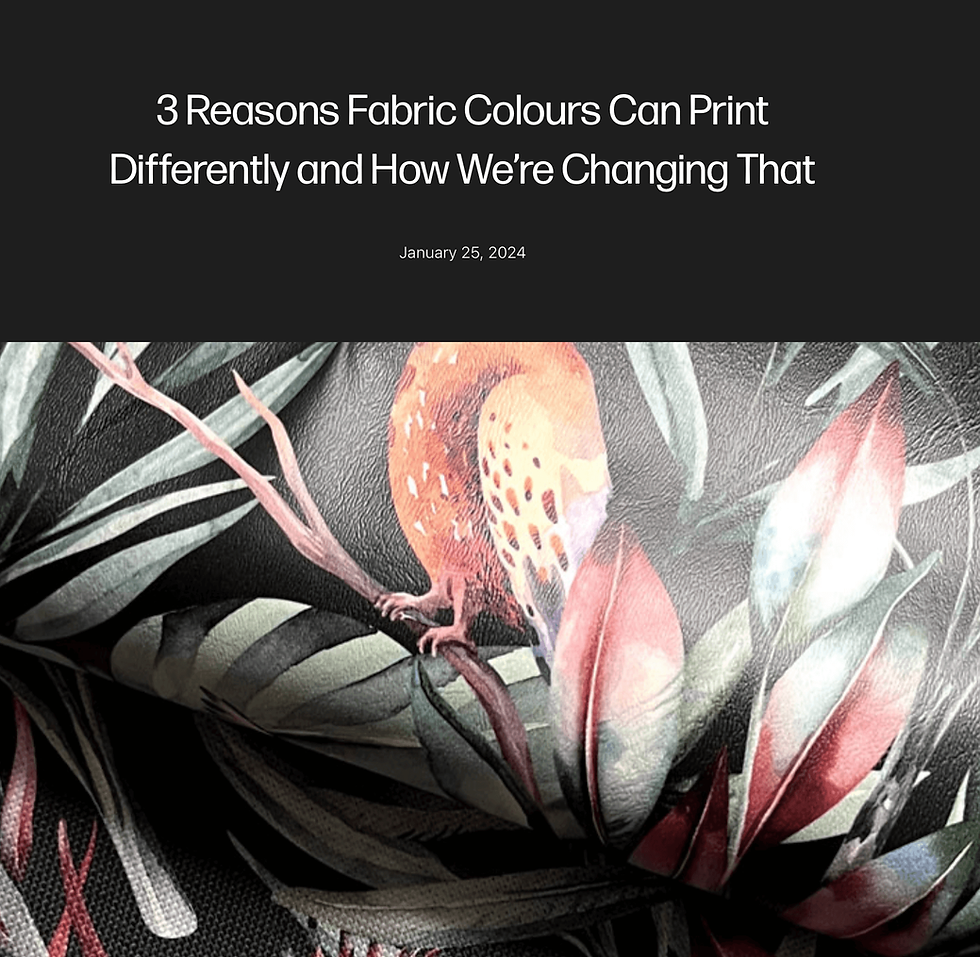
For more understanding, here is a great article from a printing company Mereton Textiles based in Australia: 3 Reasons Fabric Colours Can Print Differently and How We’re Changing That
What are Strike offs? Strike offs Explained:

In the fashion industry, a strike off is a sample of a fabric print that is produced for approval before the final fabric is printed. First you will be selecting your artwork, either from a print studio where you purchase the artwork, or a textile artist that you may have in-house or as a free-lancer. The artwork has to be prepped, meaning you have to provide the colors within the print, create a schematic including color positions and scale. This is passed on to the factory or printing partner.
The textile print strike off is then created by a textile supplier or manufacturer and sent to the designer or brand for approval. It is typically a small swatch of fabric that shows the print design and colors in the correct scale and repeat pattern. The strike off allows the designer to see how the print will look on the final fabric before it is produced in bulk.
The strike off process involves creating a print design and transferring it onto a sample fabric using the chosen printing technique. This can include digital printing, screen printing, or block printing. The sample fabric is then sent to the designer for approval.
*When reviewing your strike offs, it is crucial you are comparing them to your solid lab dips- printed color and dyed colors will vary, but you can expect to get your prints and solids to the best possible match so that again, they can be merchandised together, presented cohesively & worn together by the consumer.

This may take a few iterations again- my rule of thumb is no more than 3 iterations- once you get past 3, you are either being not clear enough in your comments to the supplier, or perhaps being too picky. Yes there are occasions where a color or layout may be more difficult to achieve, but you have to take into consideration why it may not be working and adjust accordingly. Good suppliers will work with you to achieve and their expertise should be respected. Making comments for more and more updates will hinder your process, your timeline and your reputation as a designer.
Once the strike off is approved, the final fabric is printed using the same printing technique and color specifications as the strike off. The strike off process is important for ensuring that the final printed fabric meets the designer's vision and quality standards.
Overall, strike offs are an essential part of the textile printing process and help designers and brands to create high-quality and visually appealing fabrics for their collections.
Have more questions or requests on specific steps in the process? Let us know! We are here to provide knowledge and design how tos to help you in your creative journey!
Send a comment, request or suggestions here: design@insidefashiondesign.net

To learn more Design How Tos: Subscribe to our newsletter to not miss any new How Tos! Stay tuned for How To Set Up print artwork, along with templates for submitting to a printer or manufacturer & print studios we love!
Know someone who would like this article? Please share!

Have you found a supportive online community yet? We invite you! Free and open to all those interested in connecting, gaining insights and inspirations and joining us to make a positive impact in the fashion industry.


Using technology to increase access to youth mental health support may offer a practical way for young people to reach guidance, safe-spaces, and early help without feeling overwhelmed by traditional systems. Digital platforms, helplines, and apps could give them a chance to seek support privately, connect with trained listeners-orexplore resources that might ease their emotional load. This gentle shift toward tech-based support may encourage youth to open-up at their own pace, especially when in-person help feels too heavy to approach.
There is always a chance that these tools-quietly make support feel closer than before, creating moments where help appears just a tap away. Even a small digital interaction might bring a sense of comfort. And somewhere in that space, you…
Detailed and practical, this guide explains concrete rebar in a way that feels approachable without oversimplifying. The step by step clarity is especially useful for readers new to the subject. I recently came across a construction related explanation on https://hurenberlin.com that offered a similar level of clarity, and this article fits right in with that quality. Great شيخ روحاني resource. explanation feels practical for everyday rauhane users. I checked recommended tools on https://www.eljnoub.com
s3udy
q8yat
elso9
I'm intrigued by the concept of lab dips confirming color accuracy, as mentioned in the article, and I'd love to know more about the typical turnaround time for receiving these samples from textile suppliers.
ai image to text
I found matlab assignment help useful while practicing MATLAB problems, especially for understanding logic errors and improving my coding approach.
I think Escape Road 2 is one of those games that’s great for both kids and adults.